
Mechayeh: Website, Copy & Comms
Mechayeh — Website, copy & comms
Website design & build · Product copywriting · Email · Merch
2024–present
The Challenge
A name nobody can say out loud.
Packaging gets a few seconds and a person already holding the box. The website gets neither. Mechayeh is a Yiddish word — it means "it gives life" — and it's the right name for the brand, but it's also a word most customers have never seen, can't pronounce, and won't type into a search bar correctly.
So the digital side of the brand had one job before it had any others: teach people the name without ever sounding like a lesson.
The Voice
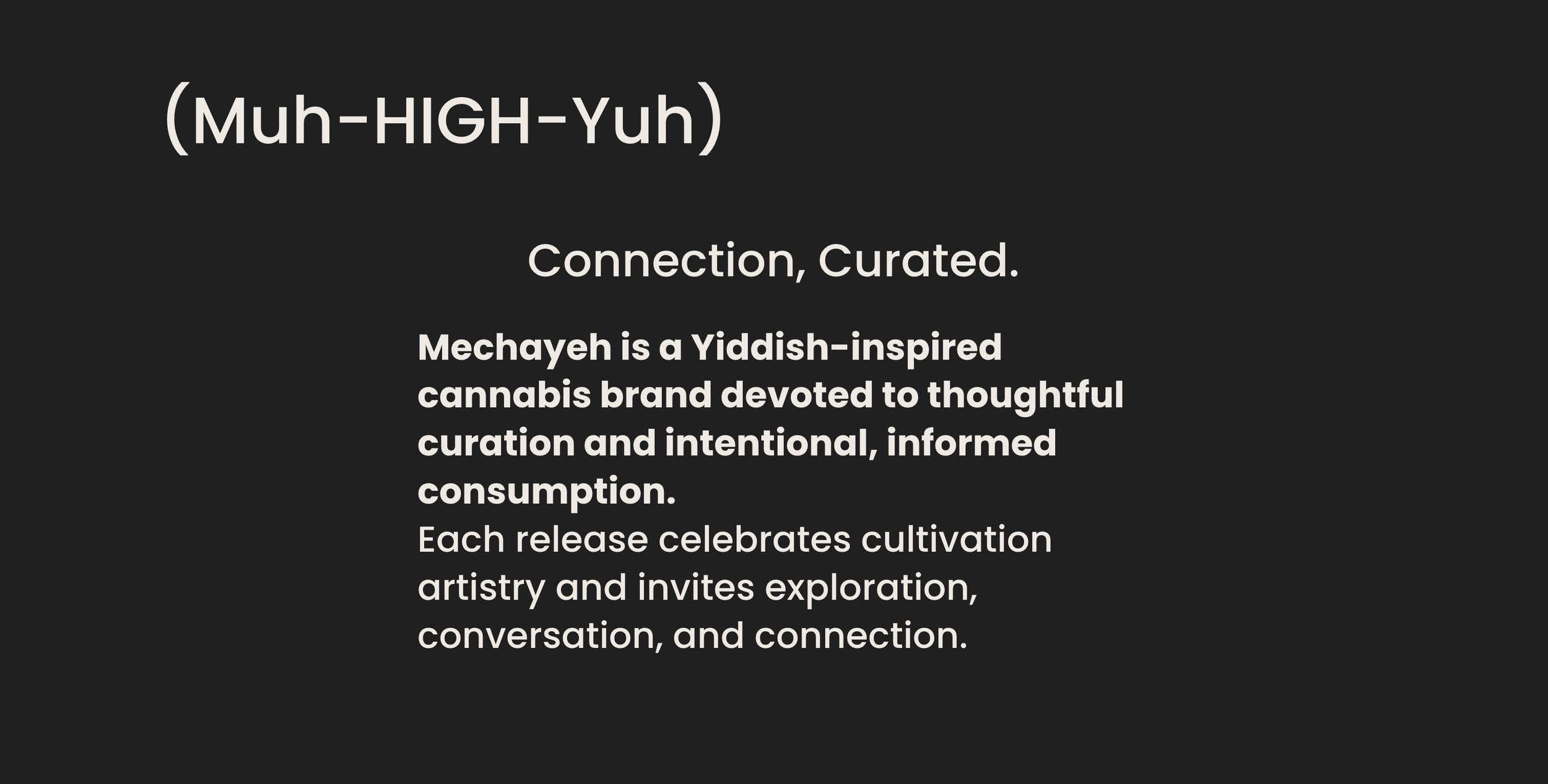
Connection, Curated.
The site opens on three lines and a pronunciation: (Muh-HIGH-Yuh). Putting it right there, in the brand's own typography rather than tucked into an FAQ, turns the hardest thing about the name into the most memorable thing about it. People who can say a brand's name will recommend it.
From there the voice does the rest — warm, plain, unhurried. Cannabis marketing tends to swing between clinical and stoner-cliché. Mechayeh sits in neither: it talks about curation, cultivators, and connection the way you'd talk to someone across a counter.
The Product Copy
Copy that has to be rewritten every release.
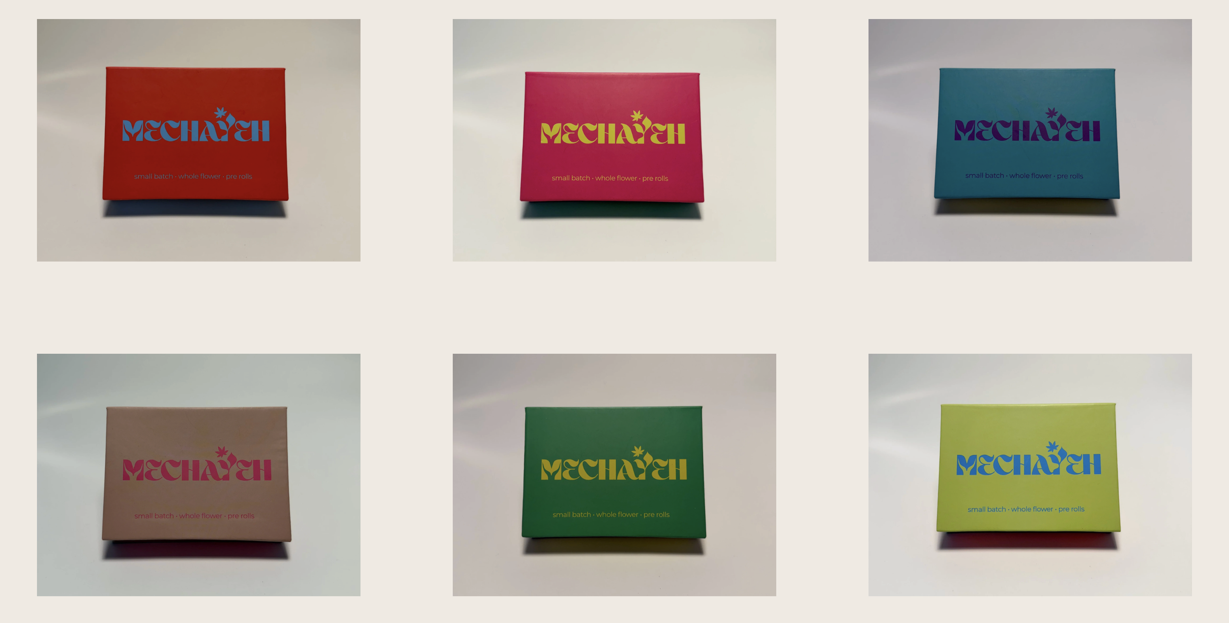
The Variety Pack is a rotating set — different cultivators, different strains, every few months. That means the product copy can never be written once. I built a repeatable structure for it: the cultivator gets named and credited, the pack gets a through-line, and the format stays consistent enough that returning customers know where to look.
It's the same problem the packaging solved with color, answered in words.
Mechayeh Moments.
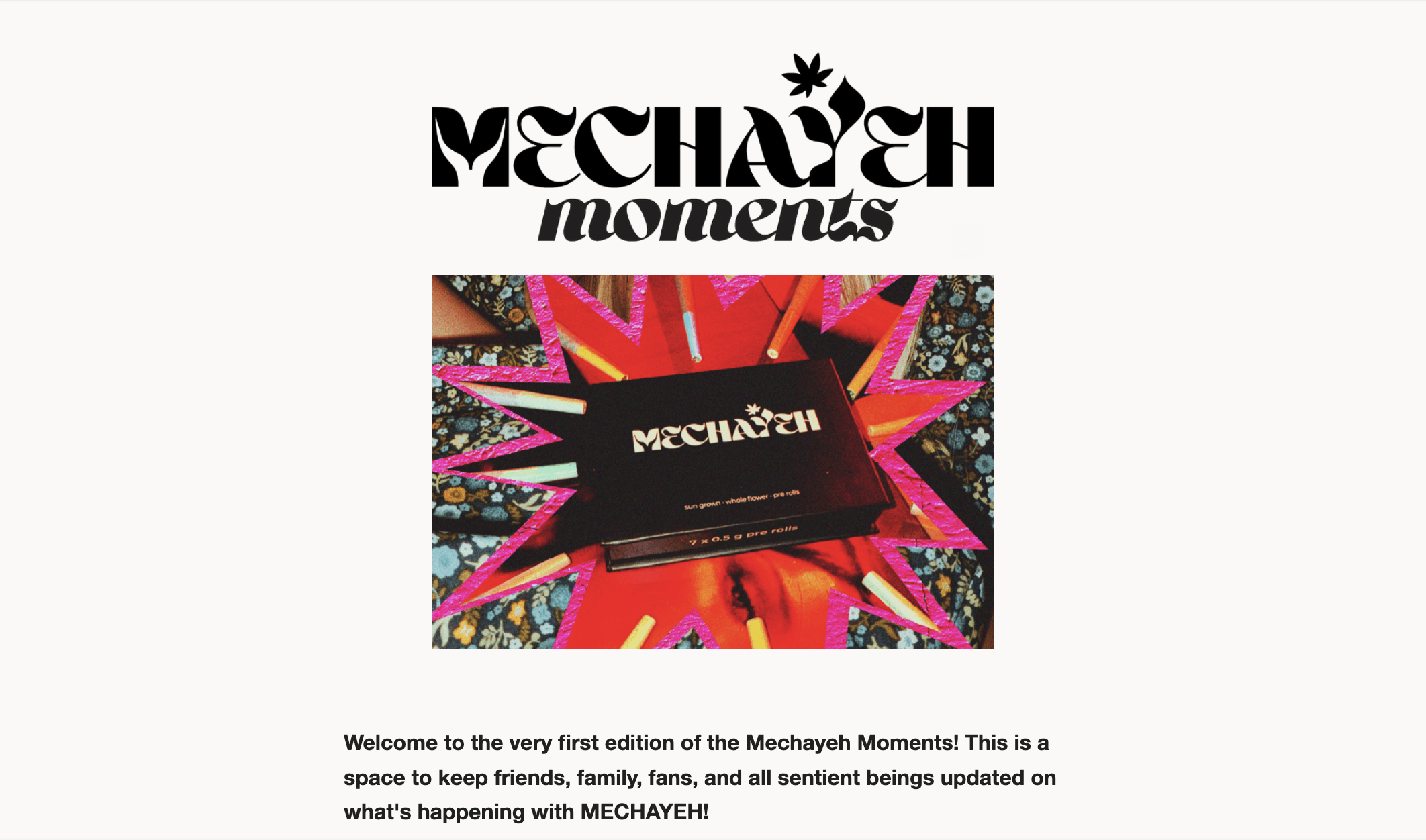
The newsletter carries the same voice into the inbox — what's in the current release, the cultivators behind it, and the reasoning that connects them. Volume 1 went out in September 2026 to 111 subscribers. 63% opened it and 11% clicked through.
The signup on the homepage — "Get Connected!" — is the site's main conversion point, so the email and the website are one system: the site earns the address, the newsletter keeps the relationship alive between releases.
Merch
The quiet test of a wordmark.
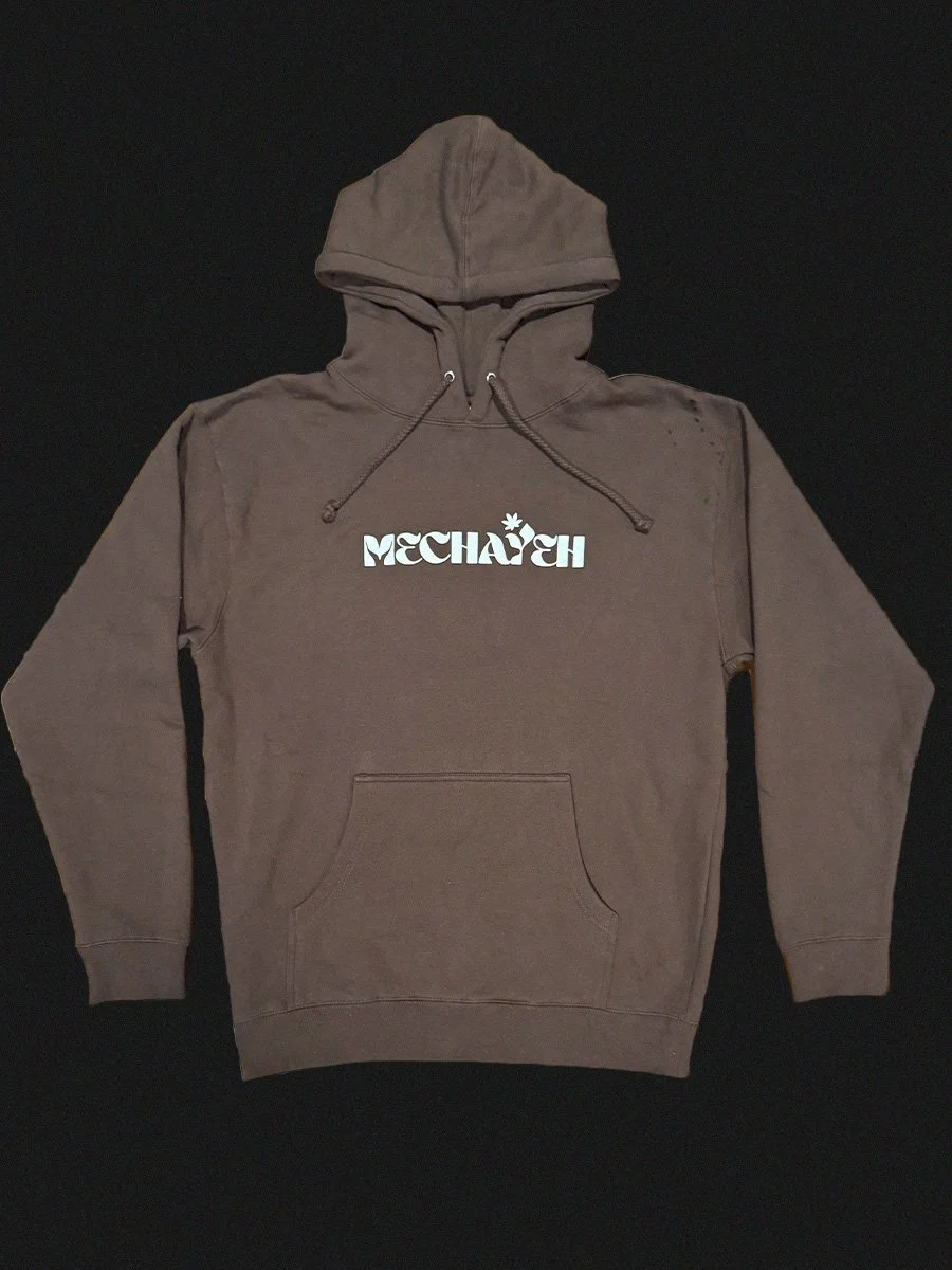
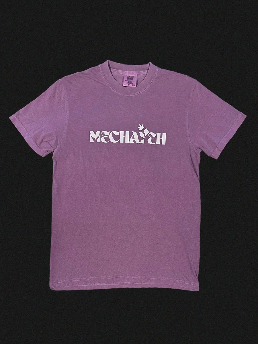
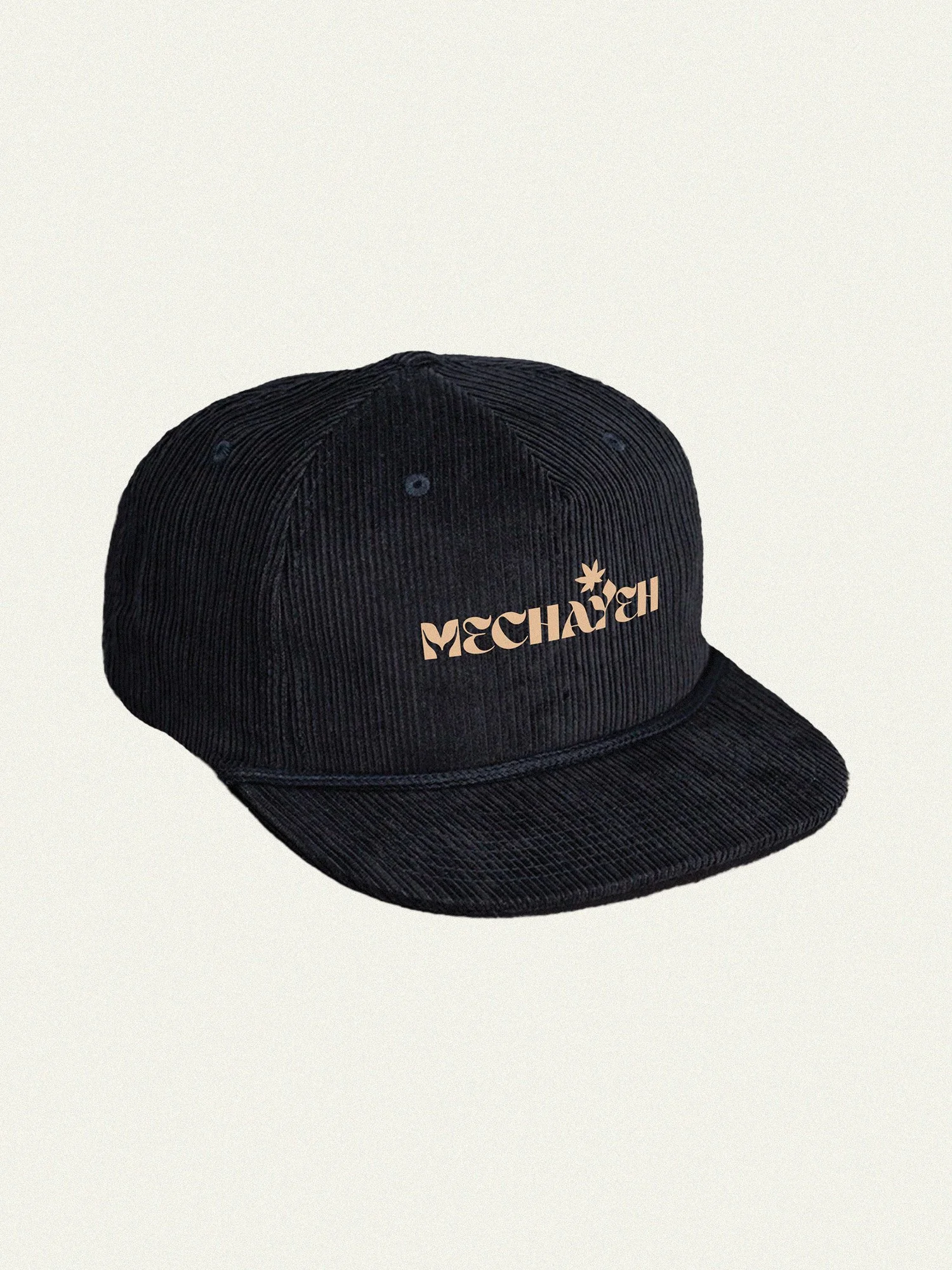
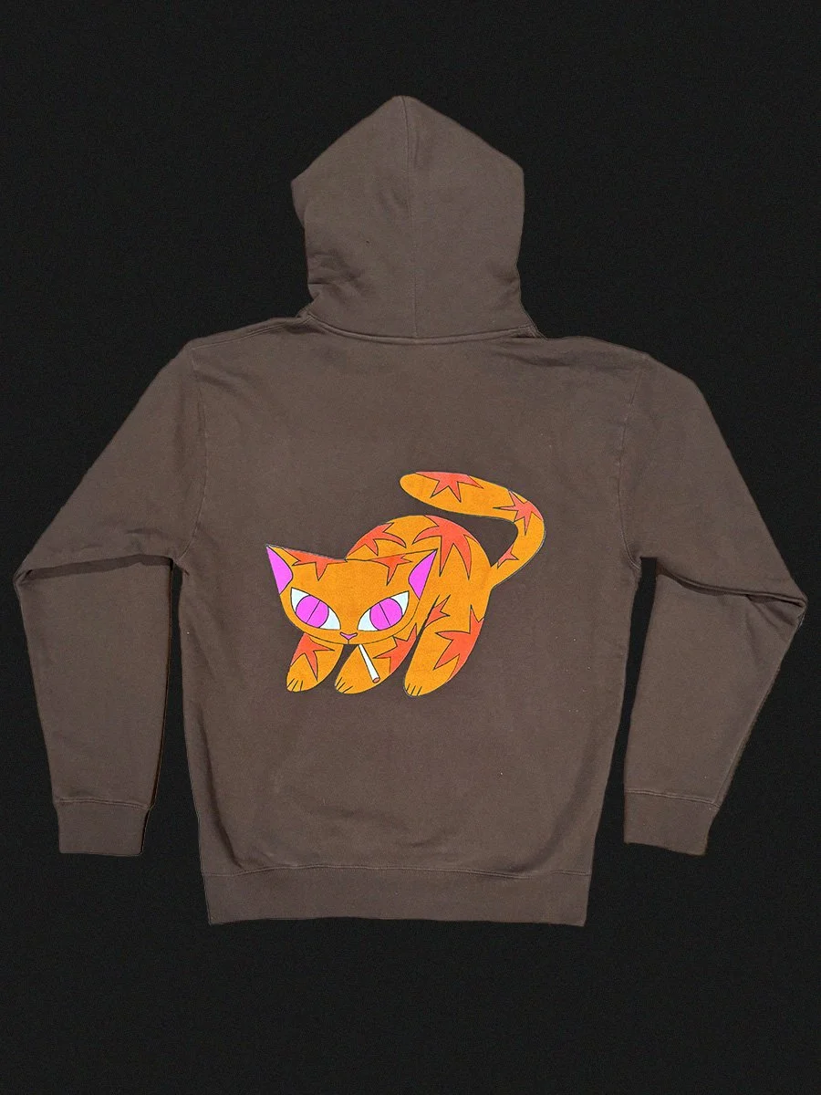
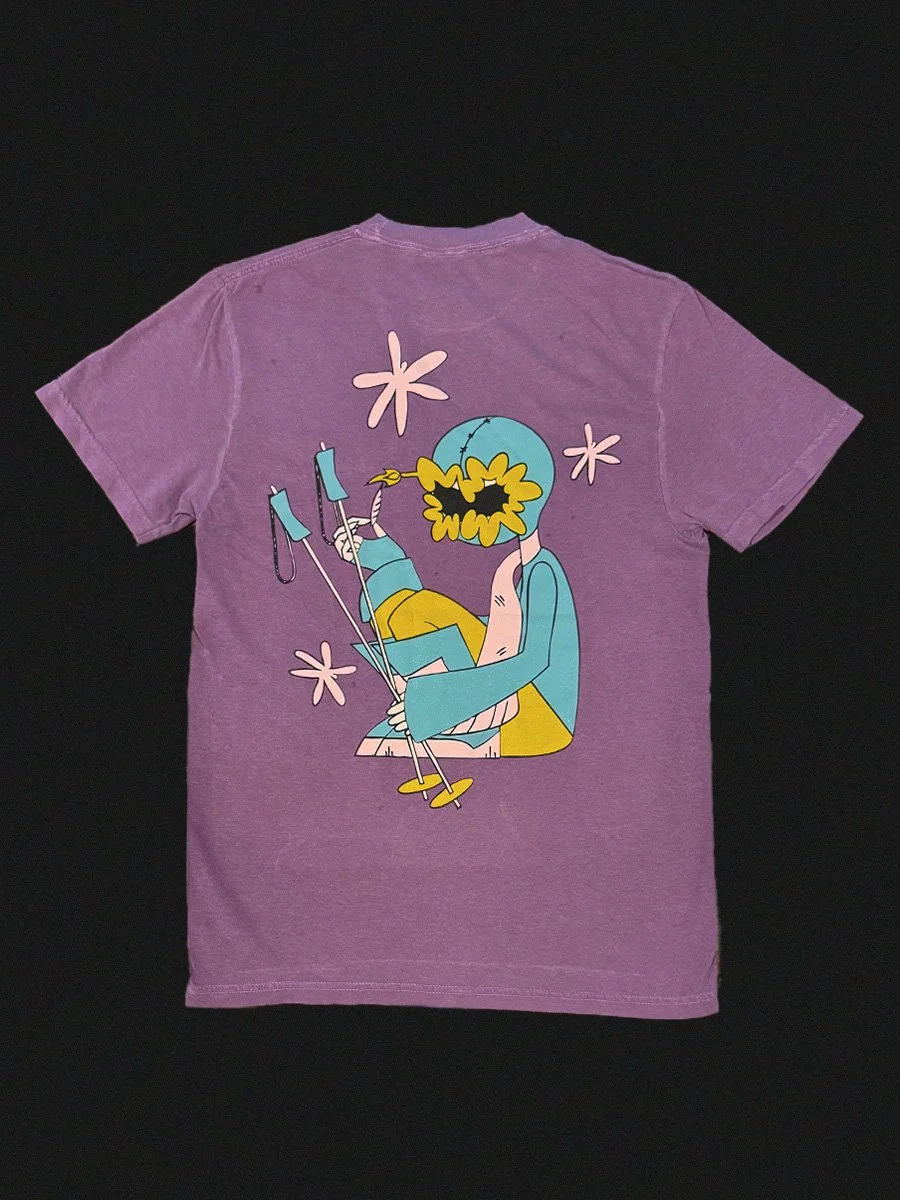
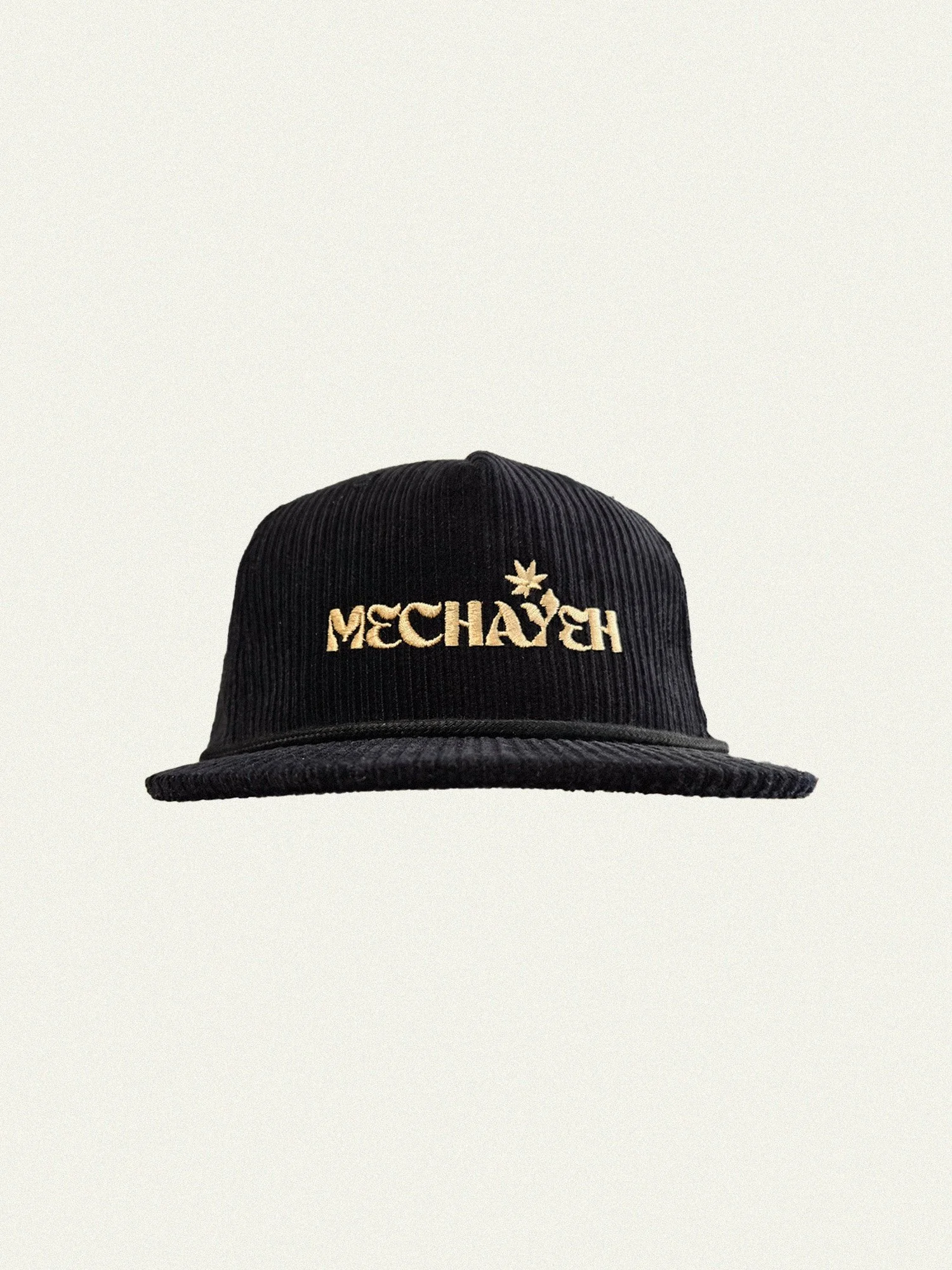
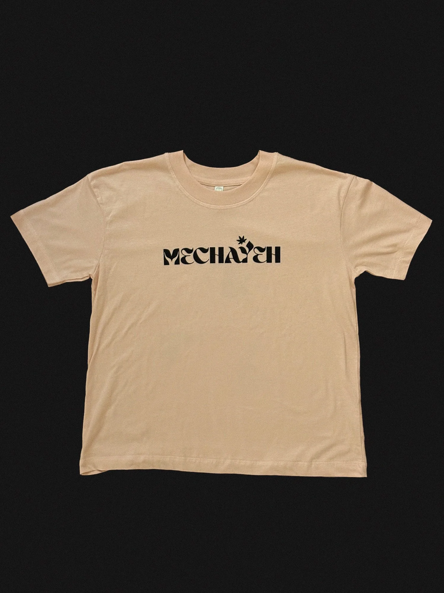
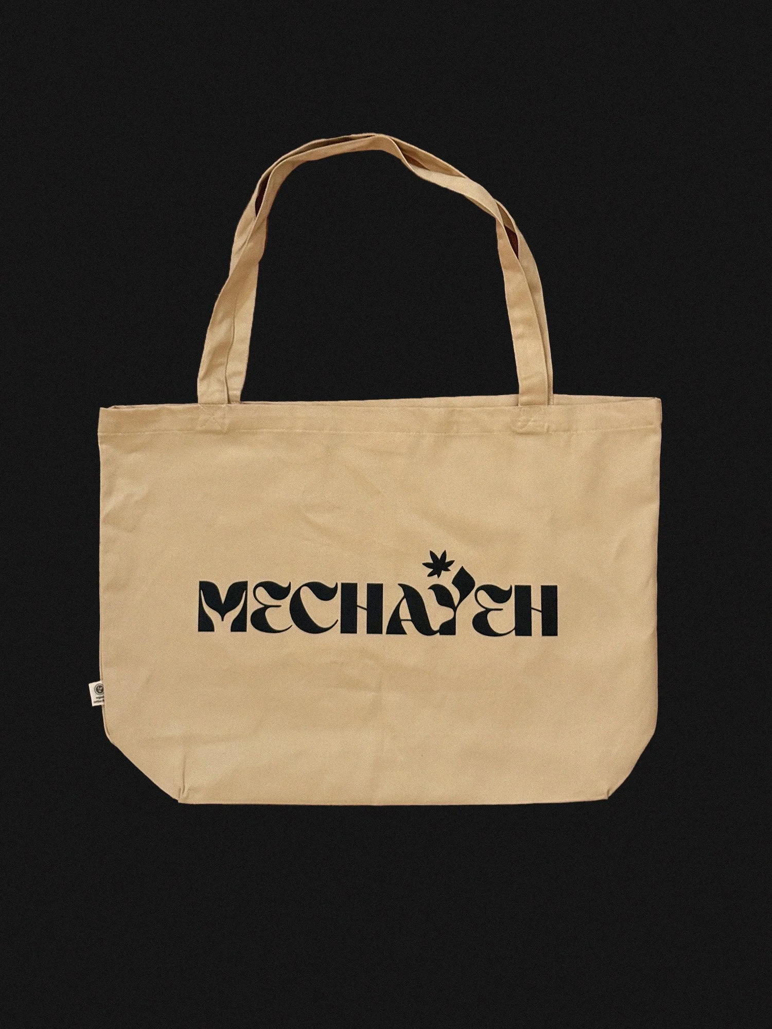
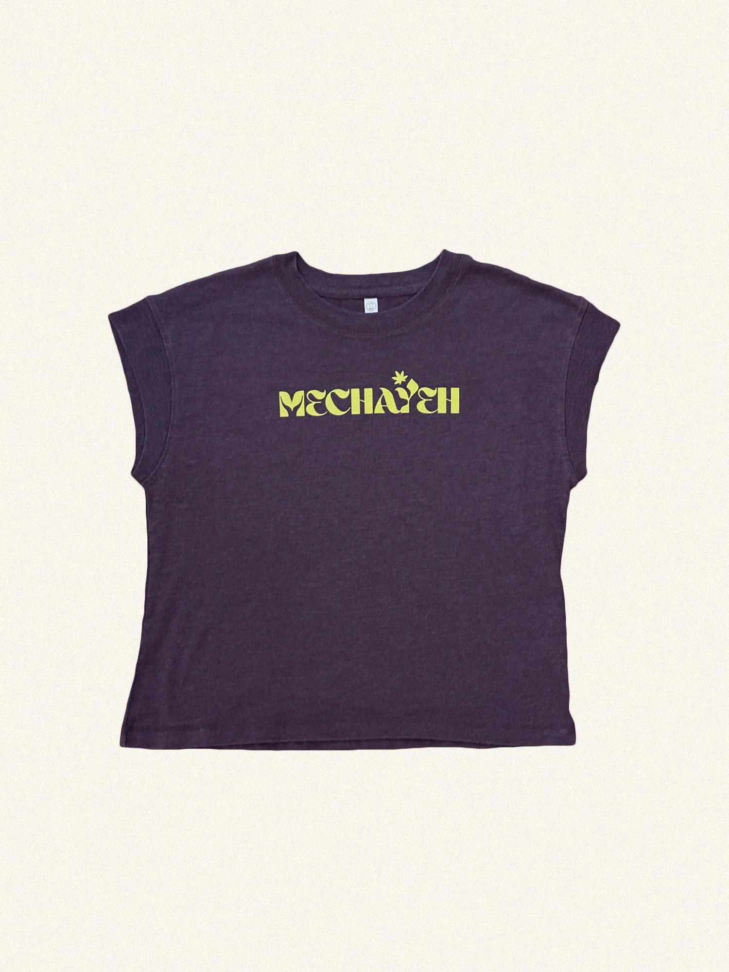
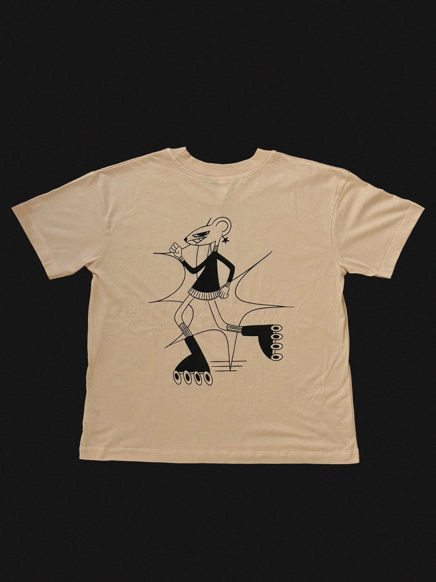
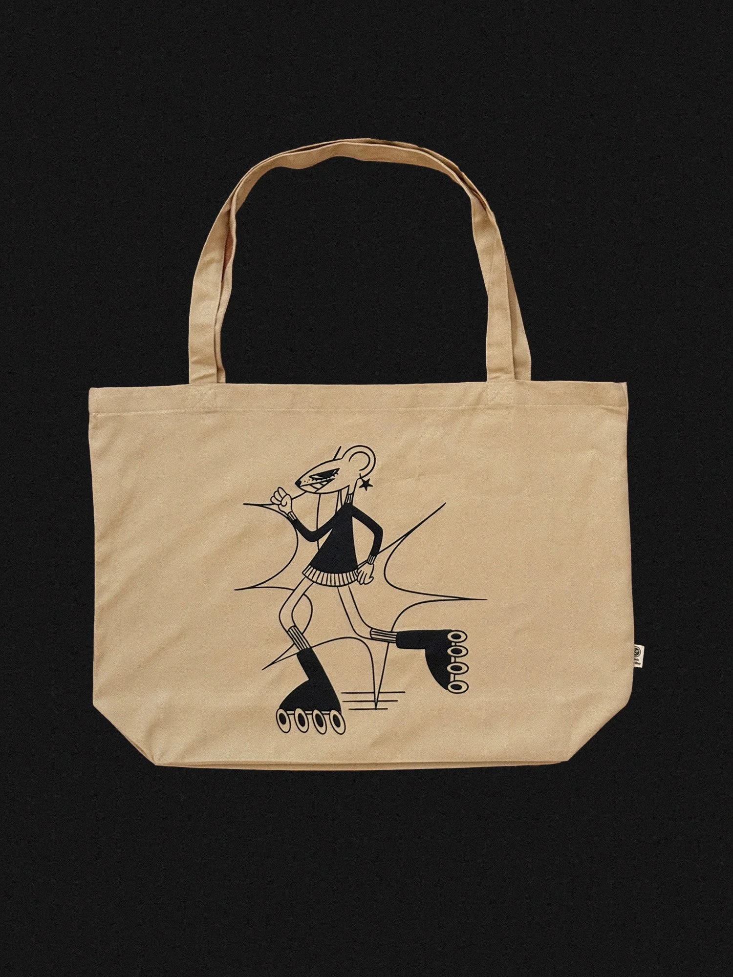
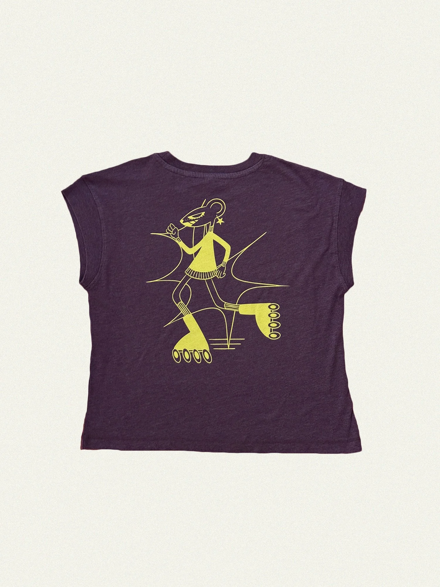
A logo that only works on a box isn't a logo, it's a label. Tees, totes, and apparel are where the mark has to survive being scaled, stitched, and worn by someone who isn't thinking about branding at all — and where a customer choosing to wear it is the strongest signal a brand gets.
The Result
A list that opens.
Volume 1 reached 111 subscribers and 63% of them opened it — for a brand whose name most people had to learn how to say a year ago, that's the number that matters. The website taught them the word. The newsletter is what keeps them coming back for the next release.
Building something small-batch and want it to hold up on a shelf?
I take on a handful of brand projects a year.