The Challenge
Building a brand from nothing.
Mechayeh came to me with no brand at all — no logo, no packaging, no visual identity. Just a mission: small-farm flower, community, and making cannabis feel approachable and intentional. I built Mechayeh from the ground up. Cannabis shelves are loud — everything is neon, everything shouts. But Mechayeh's personality is calm and grounded, so shouting back wasn't an option. I made a bet: that a genuinely clean, simple design would cut through because everything around it was busy.
The System
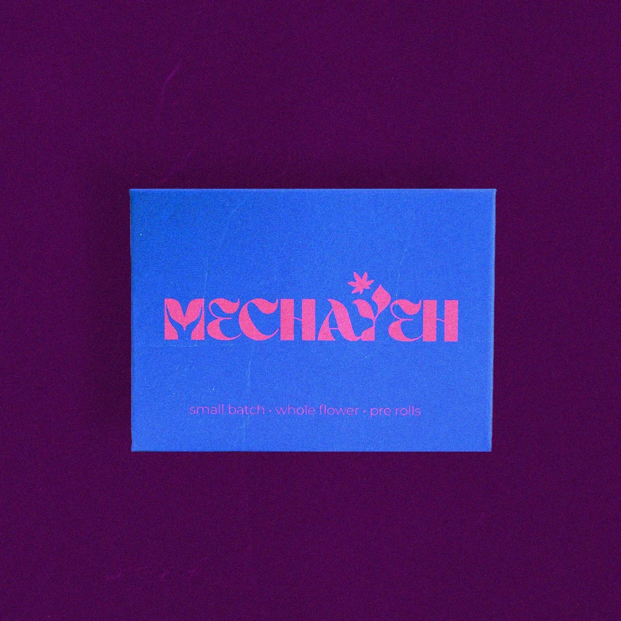
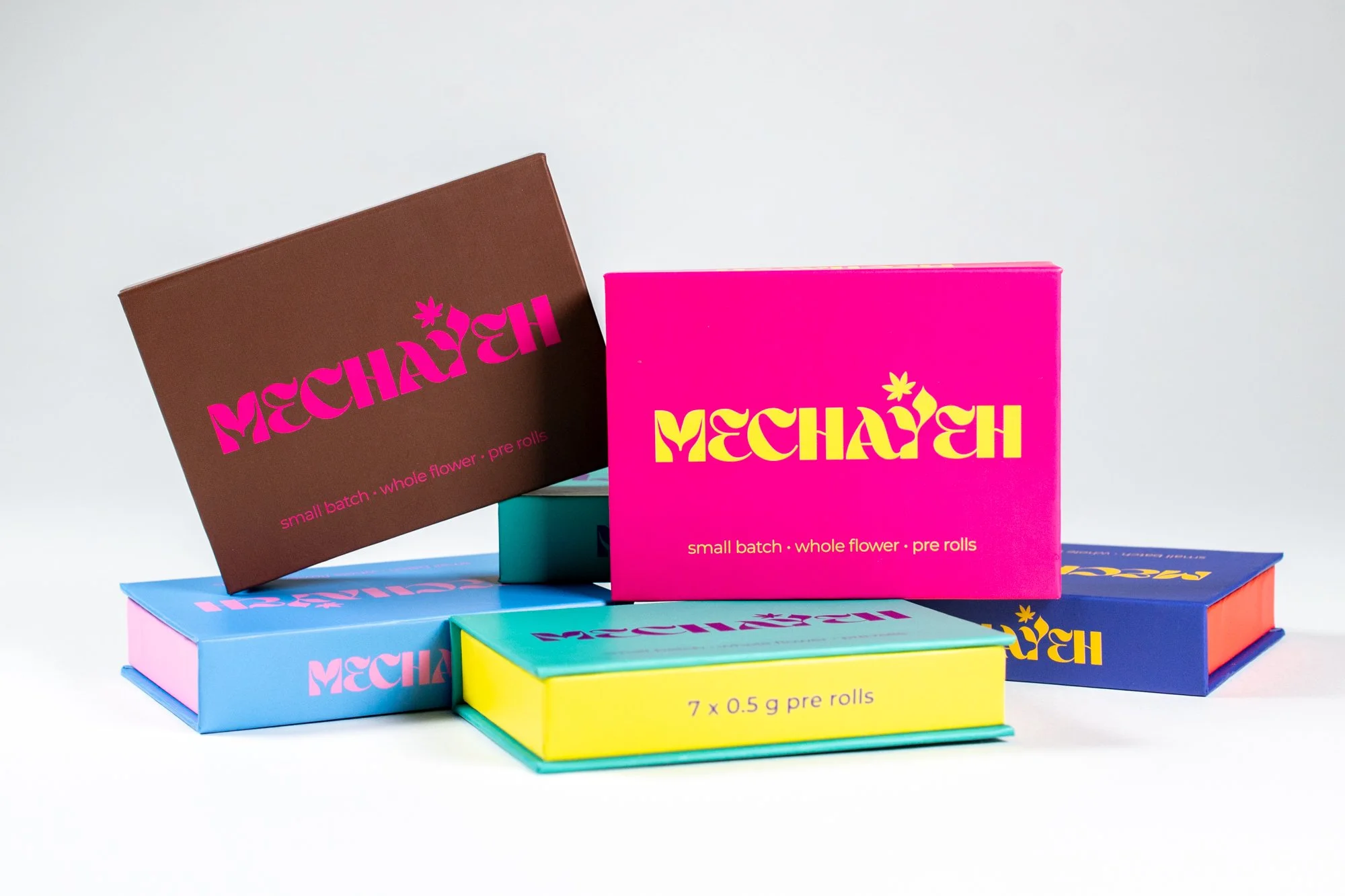
Mechayeh sells variety packs, so the strains and farmers behind them are always rotating. Instead of fighting that, I built it into the packaging.
Every box uses the same layout — same structure, same logo, same feel — but the color changes every few months. The consistency makes the brand instantly recognizable; the rotating color makes each release feel new. There are now over 20 boxes, each a different color, and customers treat them like collectibles.
#EADDCB
#212020

Stretching the System
A second product.
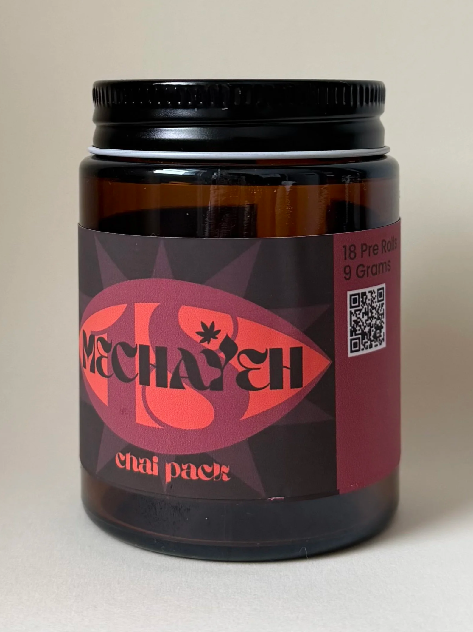
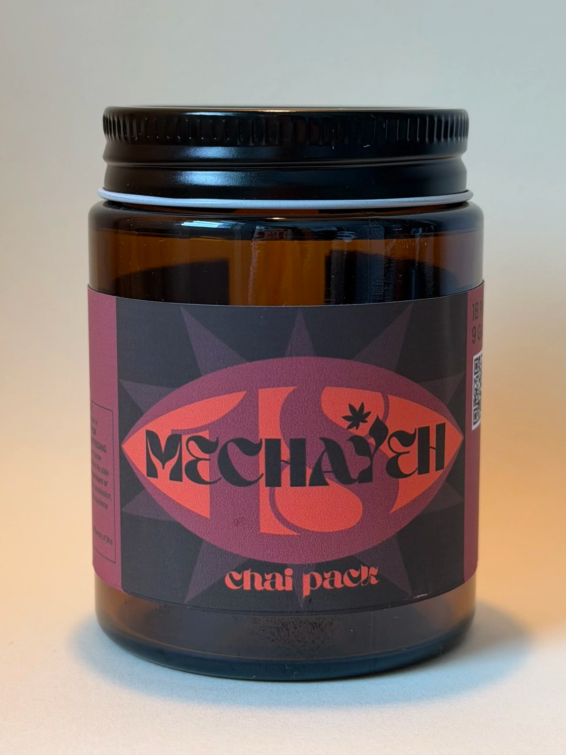
When Mechayeh added a lower-priced product — Chai Packs, 18 joints in a jar instead of a box — the identity had to flex to a completely different format and price point without losing the brand. Same visual language, new form: the jar reads as unmistakably Mechayeh on the shelf while signaling it's the more accessible option. A brand system is only as good as its ability to grow, and this is where it proved it could.
Extending the brand
A complete brand world.
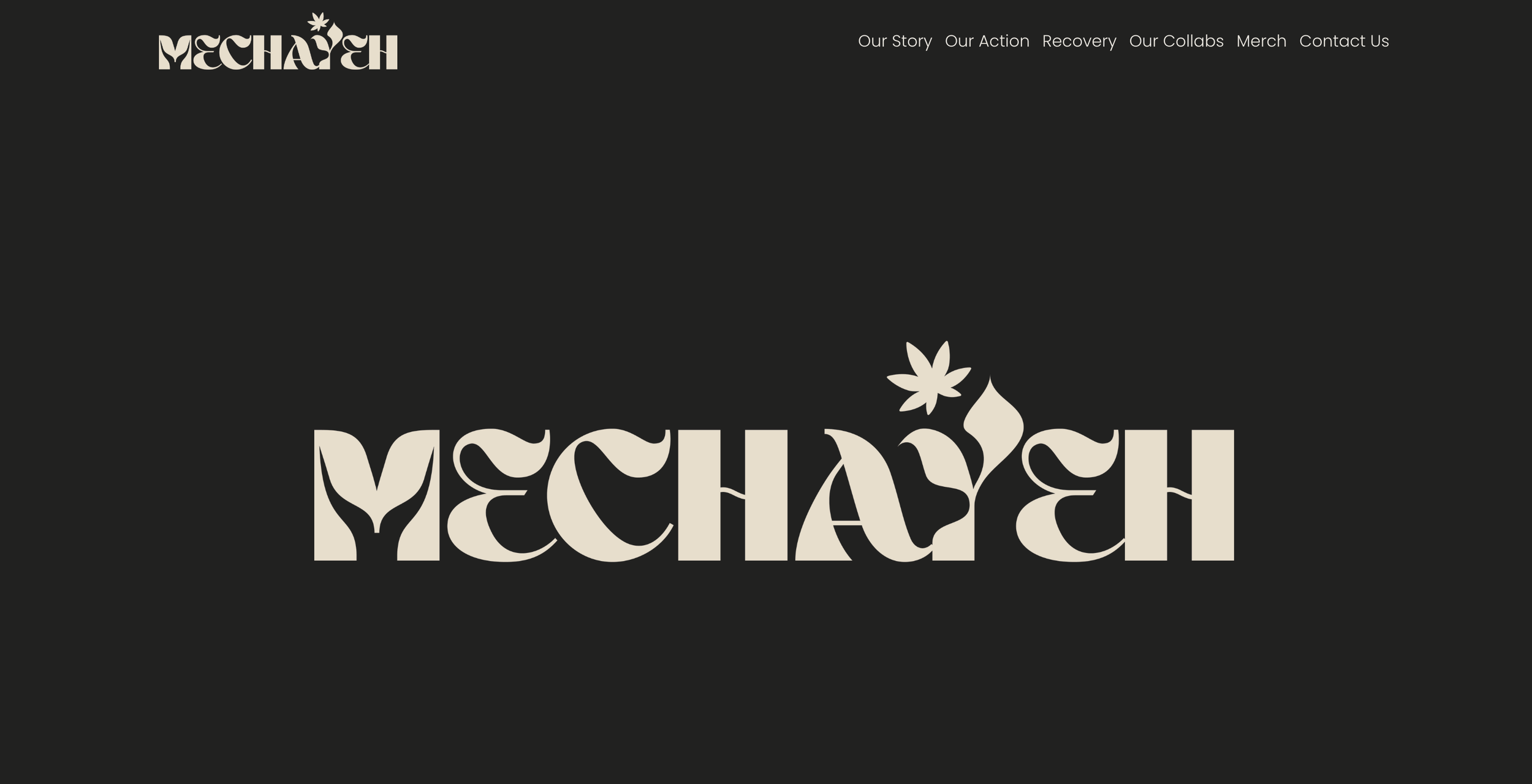
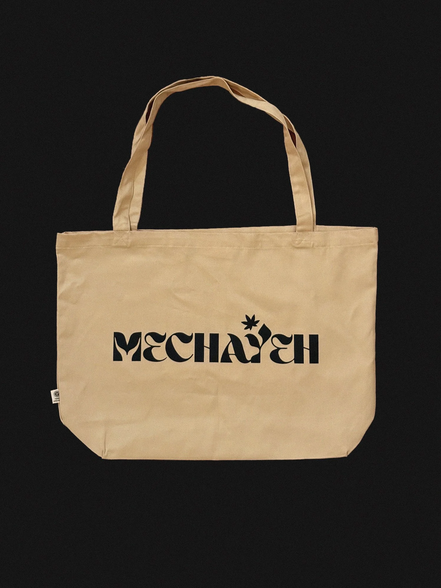
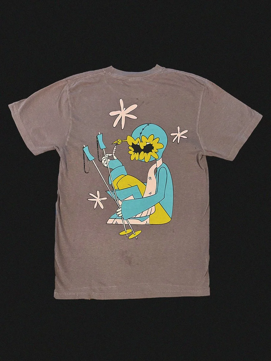
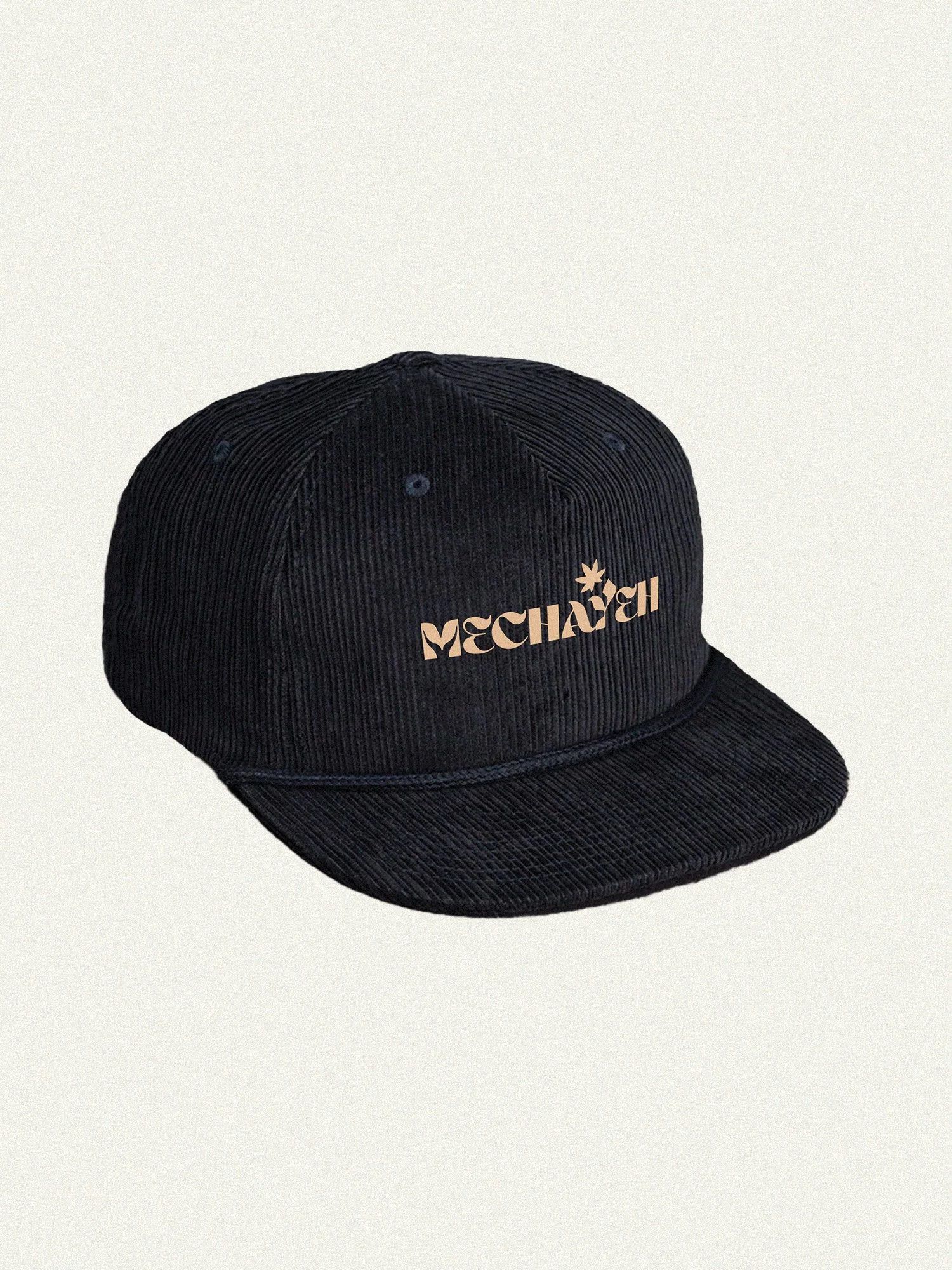
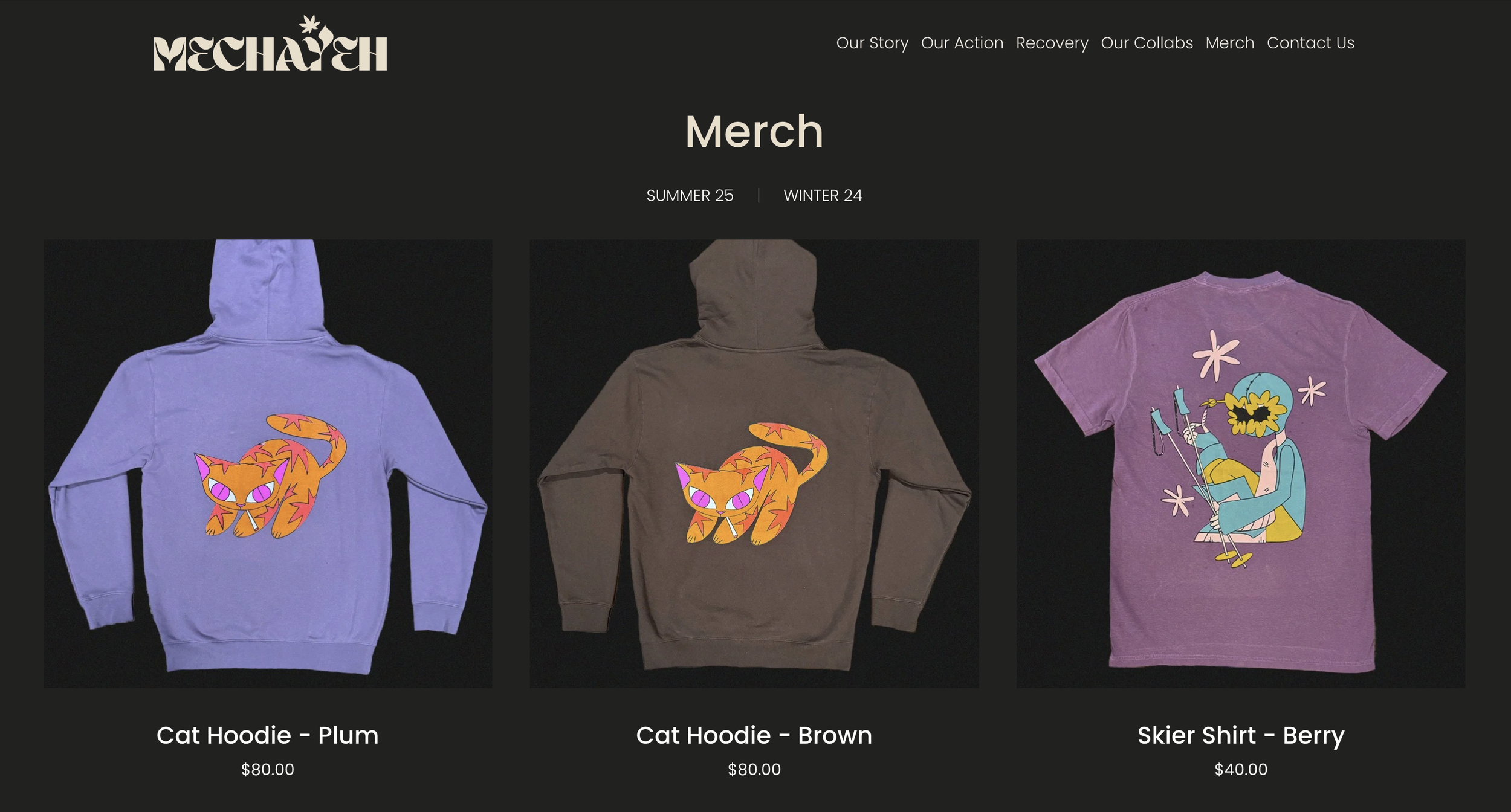
The identity carries all the way through. I designed and built Mechayeh's website so the brand feels the same on screen as it does on the shelf — and extended it into merch: tees, totes, and apparel that let people carry the brand with them.